Reflective Vision
The title of this series, Reflective Vision, was chosen for it’s multiple meanings. The subject matter, doors, windows and passageways, are both vision and illusion while the concept behind the series, the “vision” of the artist, is also reflection, contemplation. Both physically and metaphorically, we do not see without some form of illumination. Without light we are in the dark; with light all becomes clear.
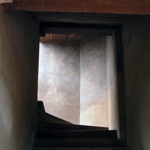
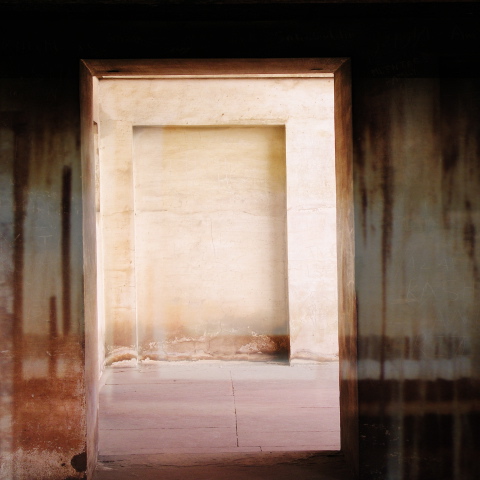
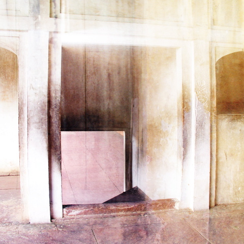
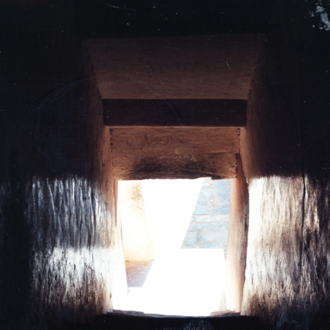
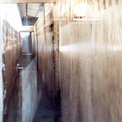
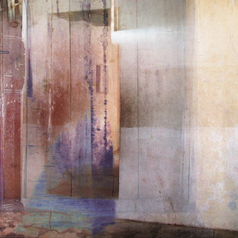
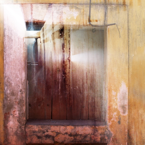
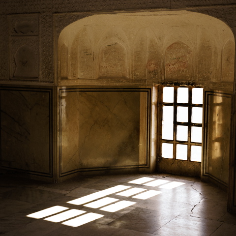
These images of doors, windows and passageways are luminous. Some appear and disappear as if refracted by brilliant sunlight or mirrors. Others softly glow in the surround of shadow. Related to the images in the series, Passages, they are printed on aluminum, 24″ x 24″ and on translucent banner material 36″ x 36″. How the images were made is described in the Process section.
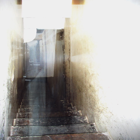
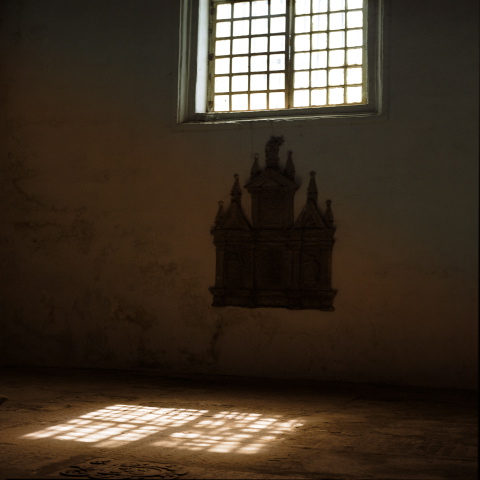
Reviewing the exhibition at Judi Rotenberg Gallery on Newbury Street, Boston, Cate McQuaid said: “Dorothy Simpson Krause has always created lush and varied surfaces for her digital prints. … Krause pares the imagery and ramps up the rich variety of surface, to wonderful effect. The images are still full of symbolic content, but here Krause offers just one potent one: the door. She travels the world photographing doors and gates. Krause prints the photos on aluminum or Plexiglas, sometimes layered over metal, sometimes coated with ink on the reverse. She’ll print over nails, grating and old metal; she adds paint, pencil marks, and scratches. Even so, my favorites are the simplest works: photos printed on brushed aluminum, with little or nothing added. The aluminum reflects light out at the viewer. Each doorway becomes a tense drama of light and dark. “Downstairs” has us looking up a flight of dingy stairs to a door; the sheen of light creates a palpable presence. In “Amber”, shot at the Amber Palace in Jaipur, India, the amber color looks like gold leaf. A window casts light onto the dark floor. Whether in a palace or a basement, Krause creates mystical rhythms of shadow and light.”
Cate McQuaid, Art Critic, The Boston Globe
“With a wonderful sense of color which creates the atmosphere of calm and contemplation, she combines what is here and there … transcendence – that which is indefinable, unrecognizable and does not have to be called in order to be.”
Anna Panek Kusz, Curator, Gallery Okno, Slubice, Poland